Ecommerce
Ecommerce Dashboard
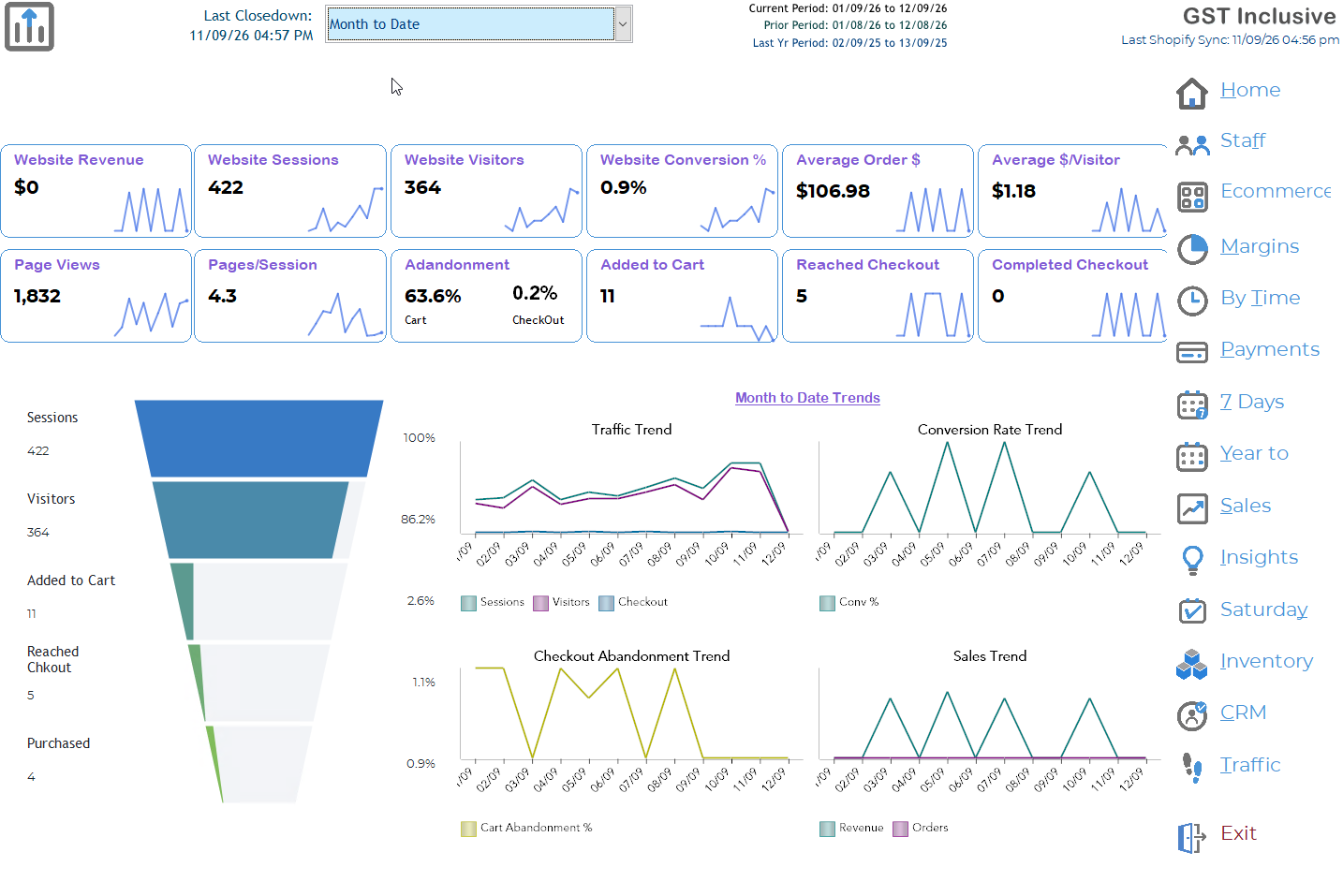
The Ecommerce Dashboard gives you an at-a-glance view of how your online store is performing. It combines website activity, customer behaviour and online sales information so you can quickly see how many people are visiting your website, how they are interacting with it, and how successfully those visits are turning into sales.
Use the period selector at the top of the screen to change the period being viewed. The dates shown at the top right confirm the Current Period, Prior Period and Last Year Period, making it easier to compare current performance with previous periods.
Website Activity
The boxes across the top of the dashboard provide the key measures for the selected period.
Website Revenue
The value of sales generated through your website.
Website Sessions
The number of visits to your website. A customer can visit more than once, so one visitor may create several sessions.
Website Visitors
The number of individual visitors to your website.
Website Conversion %
The percentage of website sessions that resulted in a purchase. This is one of the most useful measures of how effectively your website is turning browsing into sales. Shopify defines online-store conversion in this way. (Shopify Help Center)
Average Order $
The average value of each online order.
Average $/Visitor
The average revenue generated for each website visitor.
Page Views
The total number of website pages viewed during the selected period.
Pages/Session
The average number of pages viewed during each website visit. This can help indicate how much customers are exploring your website.
Customer Journey
The Ecommerce Dashboard also shows what happens as customers move through your online store:
Sessions → Visitors → Added to Cart → Reached Checkout → Purchased
The funnel on the left makes it easy to see where customers are dropping out of the buying process. Shopify similarly uses funnel reporting to show progression from website sessions through cart additions and checkout to completed purchases. (Shopify Help Center)
For example, if you have plenty of visitors but very few Added to Cart, you may want to review your products, pricing, photographs or product descriptions. If plenty of customers add products to their carts but few reach checkout, there may be something discouraging them from proceeding. If customers reach checkout but don't purchase, review areas such as freight costs, payment options and the checkout experience.
Abandonment
Cart Abandonment shows the percentage of customers who added something to their cart but did not continue further through the purchasing process.
Checkout Abandonment shows customers who progressed to checkout but did not complete their purchase.
These figures are particularly useful because they help identify where potential sales are being lost, rather than simply showing how many sales were completed.
Trends
The graphs at the bottom of the dashboard show how ecommerce activity has changed throughout the selected period.
Traffic Trend shows website sessions, visitors and checkout activity over time.
Conversion Rate Trend shows how your website conversion rate is changing from day to day.
Checkout Abandonment Trend highlights changes in the percentage of customers leaving before completing their purchase.
Sales Trend shows online revenue and orders over time.
Rather than concentrating on a single day's result, use these graphs to look for patterns and changes. A sustained increase or decrease is generally more useful than an isolated spike.
What should I look for?
Don't judge the performance of your website from sales alone. A fall in online sales can have very different causes.
For example, fewer visitors may indicate a traffic or marketing issue, while normal visitor numbers but a lower conversion rate suggests customers are arriving but fewer are purchasing. A high cart or checkout abandonment rate suggests customers are interested enough to begin buying but are being lost before the sale is completed.
Looking at the dashboard as a whole helps you identify where to investigate, rather than simply knowing that sales have gone up or down.
Tip: Compare similar periods whenever possible. Month-to-date compared with the same stage of last month or last year will generally provide a more meaningful picture than comparing periods of different lengths.
Data Source: Website activity information is retrieved from Shopify and displayed within Ramsys. Shopify notes that analytics figures can occasionally differ depending on factors such as customer cookie consent, ad blockers and the way individual metrics are measured. (Shopify Help Center)